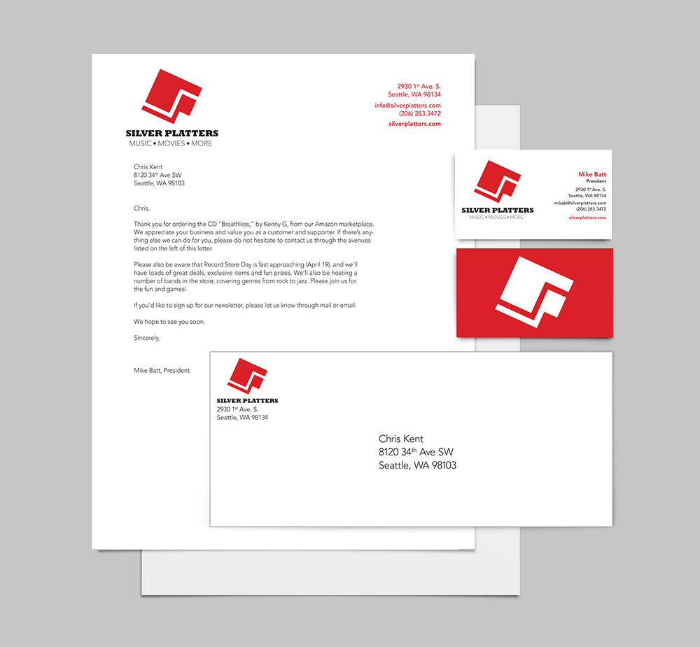
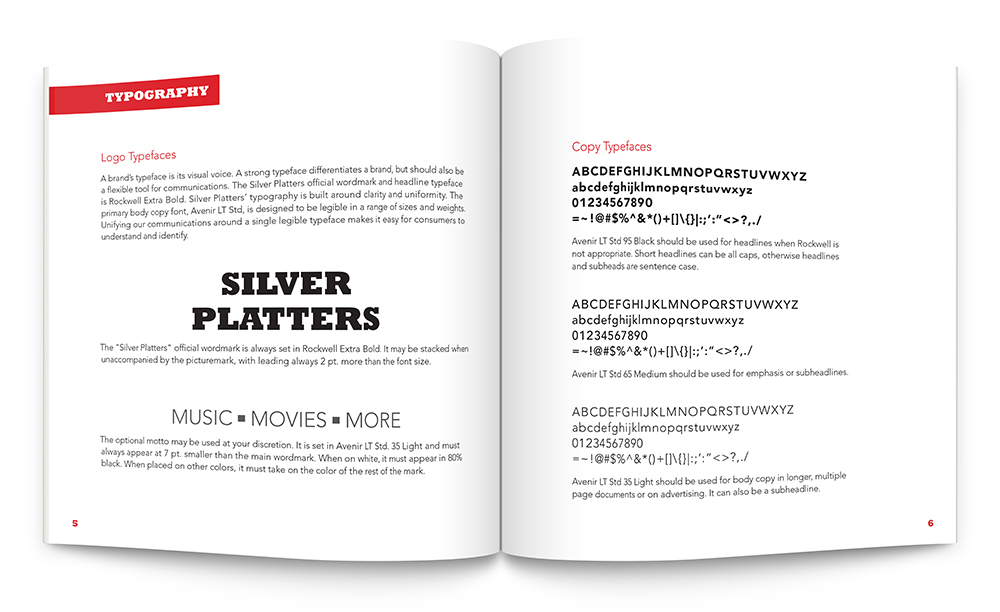
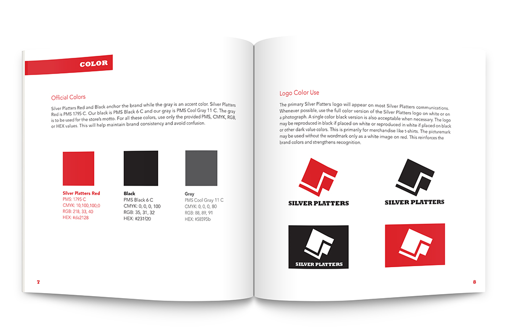
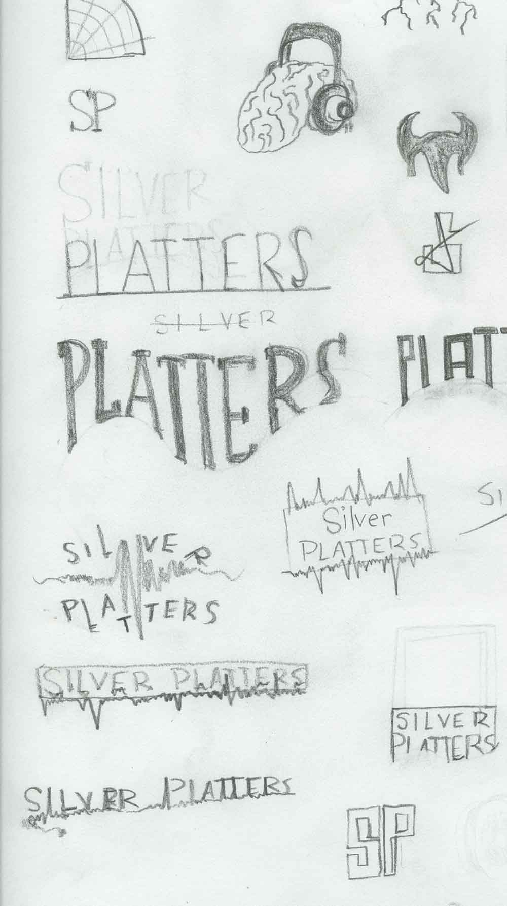
This rebranding project brings new dimension to the changing business model of store that started as a cd store. My design shows the brand as a stable and forward moving organization. Their stability is reinforced by the choice of a slab serif typeface. The red, previously a minor part of the original logo, is used here much more boldly.