PANEL
The Online Magazine for Comic Stuff
Seeing Sound: Cerebus
by Lauren Tom
November 11, 2013
A french fan of BD & Comics, I’ve only discovered Cerebus last year, and I have been utterly moved by the scale, the art and the incredible talent of Sim as a writer: each dialog, each accentuation and accent, conveys in an incredible way the orality of it all… it draws sound into panels, and the lettering that serves it is, for me, the most modern and effective form of calligraphy I’ve ever seen.
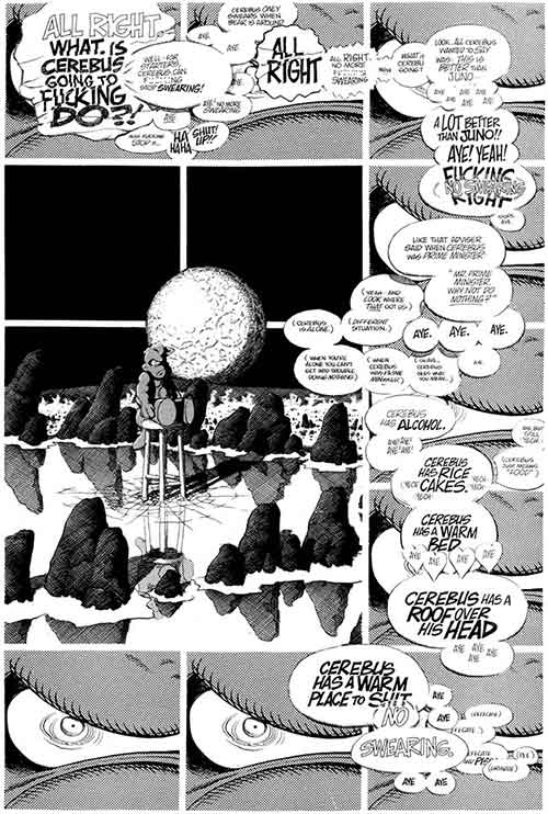
#1: Sixty-Two Balloons
Cerebus #214 (January 1997)
What makes the representation of thought, and particularly extended brooding, in Cerebus so distinctive is the stacking of balloons across panel borders, employing different combinations of line thickness, text styles, etc. to represent the conflicted and contradictory thoughts of a single character. The variation in panel shape, the use of brackets and different letter sizes, and the self-correction as swearing gets partially erased or covered with the words “(no swearing)” and the multiple assents when making a good point (“Aye. Aye. Aye.” each in a different but connected bubble) – all of these things create the impression of disconnected and leaping thoughts in a way much more natural than the articulation and properly-punctuated monologues often depicted. Unlike speech, which is linear because it takes a form governed by sequence and time, human thought (well, my own thoughts, and apparently Sim’s) is less grounded in direct sequence. Sixty-two balloons concentrated in the close-up panels, form a perimeter around the nearly forty percent of the page without any text at all (which is actually memory): the prolonged isolation that Cerebus here feels is palpable, leaving him with nothing but his thoughts.
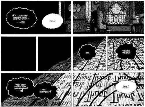
#2: Rain
Cerebus #292 (July 2003)
From the first volume to the last, Sim has worked to create a credible environment: and one finds one development in his technique over 28 years in the representation of non-visual elements within the visual medium. In an early issue, relentless rain among the Pigts represented only in the image, as dense vertical lines crowd the panels. When the rain falls on The Last Day, its constant thunt thunt thunt fills the window from which the sound emanates. The sound effect’s constant presense assumes tangibility, and we now see the thunt thunt thunt reflected on the floor during a moment’s flash of lightning. The fragmentation provided by the panel borders reinforces the passage of time and the lack of movement from the unpictured Cerebus.
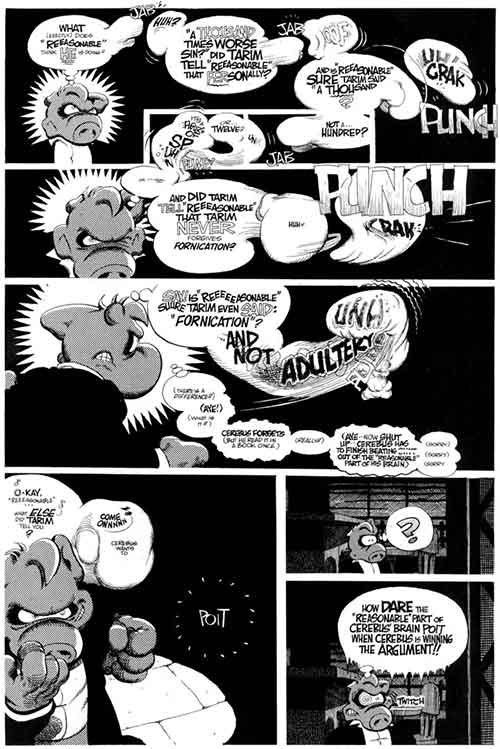
#3: Fighting Balloons
Cerebus #226 (January 1998)
In Rick’s Story, considering his lust for sweet neighbour Joanne, Cerebus’ thoughts actually engage in a fist-fight, morphing into boxing gloves, translating what it is to experience a true dilemma by the almost three-dimensional speech balloons go at each other with real violence, with vicious jabs and hooks, finishing by a devastating uppercut.
Fist-fight are emblematic of comics, cut into snapshots conveying speed, impact, intention, but here it becomes both an inner drama and a truly comical layout, as a balloon actually cracks a bone, as an idea “deflates”.
The inner monologues of Cerebus always struck me as real piece of literature but in a theatrical way: it’s the circus and theater of the mind, and typography with it scaling of the letters, its bolds, its crossed and underlined words expresses in an almost transparent way what could only be written down with a lot of stage directions in a script or a theater play. It shows the movement and the intonations of a living voice.
Quite comically, the written language has long had this reputation of being cold, because it cannot convey irony the way a human voice could, just by the sound of it: in Cerebus, the speech balloons are warm and living: vivid. Where else do you ever get a shot of that ?
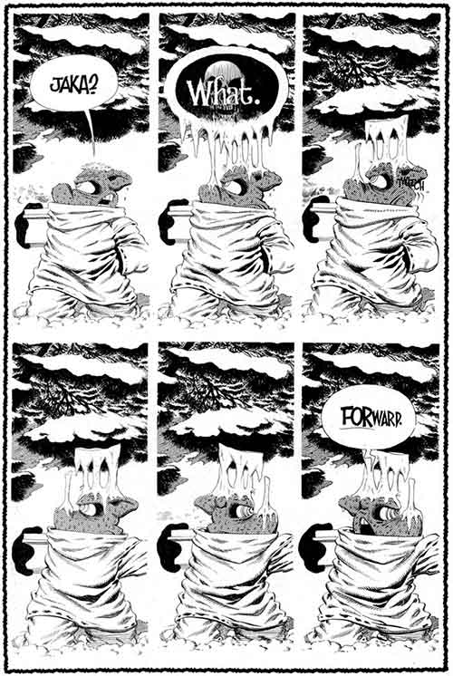
#4 Freezing balloons
Cerebus #261 (December 2000)
Another example, that I actually show to people to introduce them to Cerebus, is from Going Home, I think, when Jaka’s answer is so cold the words actually freezes over Cerebus head. Can you picture it, the panel almost challenges the reader to think, that tone? That ice over Cerebus’ head and nose shows how it feels when someone answer a single word that hits you like a bucket of cold water, and in this comic form, it’s all one, the feeling, the pun, the metaphor: that’s why it’s such a powerful experiment of the medium.
There, it’s not as concise at it should be, but I’ve been an avid reader of A Moment of Cerebus and I wanted to answer your call for suggestions. I’m happy to be part of this new generation of newcomers (I’m 24) that jumped right into the Kickstarter because I want to support a new edition of this Work, because the digital reading of comics and novels is part of my life.
For me it all began with a friend transferring High Society on my usb-Key, with this you’re-gonna-like-this face that is the true vector of sharing culture, and now I’m proud of the phonebooks that stand next to those big, ambitious and challenging volumes, where you know you’re in for a trip, such as House of Leaves.
There is a future for Cerebus, and I believe there is a future for Dave Sim if the digital version of High Society really delivers, which I know it will despite the setbacks & catastrophes. Having read Reaction To “The End?” on your blog, I also believe new editions of the saga in slimer TPBs could improve its visibility for the new generation of readers, I know From Hell’s thickness delayed for years my entry into it. The digital does get rid of this phonebook effect, but with so much to gain: details, grain, zooming and all the extras Sim seem to have in his notebooks. That’s rich, that’s depth.
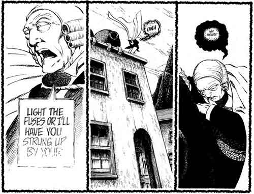
#5: Authority & Volume
Cerebus #69 (December 1984)
As an example of the variations in lettering possible, we can consider a moment near the end of Church & State I: Archbishop Powers is attempting to unify the Eastern and Western churches, and Cerebus is one of two people who stand in his way. His characterization is confident throughout, with a distinctive square balloon shape authorizing his pronouncements: dark lines, size of text and underlining all convey Archbishop Powers’ authority and volume, in contrast to those around him… At a key moment, however, President Weisshaupt, who is planning to create a political buffer between himself and the religious schism, suffers a heart attack, during a standoff with Cerebus (who has invoked divine wrath on those who do not give him their gold). Now the iconic nature of the imagery in this climatic scene is using a vocabulary established elsewhere in the volume. Both of these conventions are invoked at the critical moment, when Weisshaupt’s shouts, evoking the square balloon of Archbishop Powers, give way to silence and collapse, as his ambitions dissolve into the tiny puff in the final black balloon. Weisshaupt’s authority is removed, but the reader understands his voice is slowly fading (visual metaphors are already part of our language) while pain of frustration and broken dreams comes through in the dark lines.