PANEL
The Online Magazine for Comic Stuff
by Lauren Tom
November 11, 2013
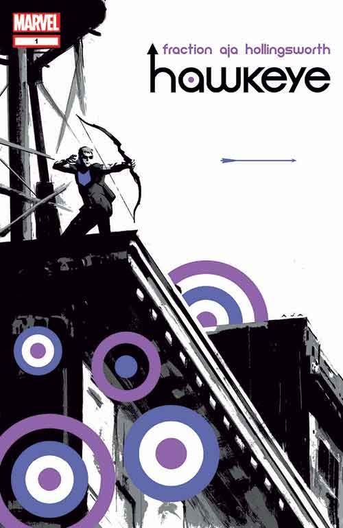
David Aja’s art is reminiscent of David Mazzucchelli’s work on Daredevil: Born Again and Batman: Year One, which is just about the highest praise I can offer. I tend to believe that the whole “gritty, urban superhero” genre peaked with the Daredevil and Batman stories in question, so putting David Aja in that company is about the only way I know to praise him as much as he deserves. Forgive me, guys, I’m only a writer. But the amount of information that Aja is able to pack into a single panel while still maintaining a fairly sparse, “cartoony” style is staggering…and he does it page after page. The rooftop party and the poker game, both in the first chapter, spring immediately to mind.

Hawkeye #1
Aja’s art is perfectly chosen for the tone and style of this book. It’s pared down and lovely, and not overly superhero-esque, but has just that right touch of hero that makes it work on so many levels for the characters and settings. It’s simultaneously loose in the way it renders Clint’s world, but also detailed enough that everything feels fleshed out and well considered. The looseness of Aja’s style lives within a highly structured and simple panel layout that contrasts nicely and also echoes some of Fraction’s contrasts. Aja’s art is a little bit Sean Phillips, a little bit Chris Samnee, and a little bit John Paul Leon (all good things to be) merging together beautifully into something that becomes decidedly his alone. I’m left waiting anxiously to see more.
As much as I enjoyed Fraction’s characterization and interesting new addition to the cast, it’s the return of David Aja to interior artwork that was the baseline selling point. Simply put: if Aja draws, I buy. And, as expected, this book is gorgeous. Aja’s stylish layouts heap character onto this book, while his thick, heavy blacks are beautifully balanced by the color work of Matt Hollingsworth. Aja’s got an ability to emote an entire city block just by the way he constructs the page; images of Clint walking in a Bed-Stuy neighborhood are particularly impressive, as the artist laces the panels with the smallest of details that makes the scenery authentic and, coupled with Hollingsworth’s brownish hues that perfectly capture the “New York City in August” from Fraction’s script, you’ve got one hell of a visual feast. While Aja doesn’t get to explode on a whole lot of action sequences in this issue, his storytelling in even the most mundane of moments make Hawkeye #1 an education in page design. There’s one brief sequence in which Clint visits an illegal casino that just might be the most impressive piece of purely visual storytelling that I’ve seen all summer.

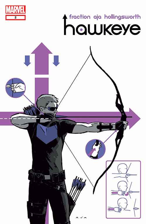
Hawkeye #2
David Aja is a master storyteller. He is also an individual and a creator always looking to find new ground to innovate. He doesn’t rest on his laurels and he isn’t complacently looking to simply ape others who attained greatness. Aja makes a page of multiple panels look pretty while moving the story along. Aja can lead an eye across a page however he likes because he builds them specifically to be read, making the clutter a cryptic puzzle that materializes into sense as you engage with it.
David Aja soars in this issue. This is a stunning book, a visual masterpiece. He structure is impeccable; the book just flows. It’s beautiful stuff. The colors, courtesy of Matt Hollingsworth, give the book an overwhelming sense of purple. I know there were other colors in this book, but all I can remember is purple. Lots of purple. That is not a criticism. Aja’s line work is enhanced by the simple color palette. These two guys click and the results are one of the best looking comic books on the stands.
“Hawkeye” #2 is sublime. There is nothing wrong with this book. The story is sharp and to the point, the art gorgeous and on point. Even Chris Eliopoulos shows greatness with the letters, especially with Barton’s whispering moment. Matt Hollingsworth brings style and cohesion to his colors. This is the ultimate second tier Marvel title as it offers everything readers generally won’t get in a tentpole book. “Uncanny X-Force” finally has a tight challenger at the house of ideas. The winner, thankfully, is everyone.

Hawkeye #3
David Aja and Matt Hollingsworth make sure that all that craziness look so damn fine. It’s gorgeous stuff. There’s something wonderful on every single page. The action moves perfectly, and the humor is so spot on it’s ridiculous. The scene were Hawkeye has his nude battle has a moment that’ll seriously make you laugh out loud. Hawkeye is such a good series that it makes me question what I had done with my life before I read it. Everything just seems so trivial and unimportant pre-Hawkeye.
Aja’s art is wonderfully evocative of the seventies action tone that Fraction wants. Aja’s action scenes are incredible, his layouts, particularly his use of small panels to relay details of the overall action, is genius and, much like Fraction’s script, there’s a constant wink and nod sense of humour to his work. Like Fraction’s script, Aja’s work is geared towards creating a fun comic that keeps you smiling throughout. Also, the fact that he gets to draw an extended car chase is awesome: Aja’s action always rules and this car chase will have you on the edge of your seat throughout the issue. Also: trick arrows. Both Aja and Fraction manage to use a huge barrage of these to emphasize just how ludicrous an archer character can be…while also making it creative and badass.

Hawkeye #4
The elephant in the room is the absence of David Aja. There is no doubt this book’s masterful delivery and mammothly favourable critical praise rests atop his simple lines and masterful layouts. He is the cherry on top of this delicious and decadent dessert and not having him is felt like a punch to the gut rendered over seven panels. However, once the kneejerk reaction abates, there is much to appreciate about Javier Pulido’s work in this issue. His Clint might not be as pretty, but his layouts come close to the effects Aja masters every month. In fact, Pulido’s retro style manages to heighten the sense this tale feels like it was pulled from the ’70s. Pulido may not be Aja, but he’s one hell of a great fill in for tone and continuity.
Pulido’s linework is reminiscent of Jack Kirby and Steve Ditko’s early Marvel work—kinetic, simplistic lay-outs with thinner-than-genre character designs. Matt Hollingsworth’s flat washes typically accent David Aja’s pulpy artwork, but here they further the “vintage” feel of Pulido’s figure work. I’m sure most will enjoy the traditional feel of the imagery, but, unlike Aja’s work, there really isn’t much going on in the panels to really engage the eye. While there isn’t necessary anything wrong with Pulido’s artwork, it still does feel like a step down from Aja’s visually stunning work on previous issues, which, in all honesty, was the real selling point for this series from the beginning.
Matt Hollingsworth is the champion of this issue as he holds everything together with his evocative and yet simple color palettes. Hollingsworth is a colorist of the school that uses emotion and scene changes to drive his use of tones and color groups. He cuts a little further out in this issue than previously as he immerses readers in the excess of Madripoor.

Hawkeye #5
Pulido’s Kirby-tinged visuals work brilliantly, giving the book an upbeat simplicity that helps to maintain a light tone even in the face of some hairy life-or-death situations. Hawkeye isn’t a gritty title, despite the complexity of the character study, but a different artist could easily turn out a shadowy, muddy pseudo-realistic swamp where Pulido opts for minimalist lines, nimble layouts and stylized framing. After the first three issues it would’ve been tempting to say the book needed David Aja to survive, but Pulido makes a convincing addition to the team.
I loved Pulido’s work on his arc with La Sangre on The Shade and I still his enjoy his pulp-infused style here. True, there’s little of the architectural wonder he displayed on The Shade, but he does offer a dazzling backdrop of the New York (?) skyline as Clint fights off ninjas on a hovercraft. Overall, the semi-deco look of Pulido’s art fits perfectly with the title’s sensibilities: it’s modern, sophisticated, and retro all at the same time. Combined with Hollingsworth’s Technicolor hues, the visuals pack a lot of punch. Just look at the panel of Masque taking a shot at Kate and Clint; between Pulido’s geometric composition and the scarlet monochrome and the old-school sound effect lettering, it’s stuff that’d make the old pulp cartoonists proud.